

Party in My Dorm Style Overhaul
When I started working on Party in my Dorm (PimD), the art style was very inconsistent. It was sometimes realistic and sometimes stylized. This was a holdover from decisions made by outsourcers before the game's launch in 2010. Since then it's gone on to make millions of dollars a year.
My role was to overhaul the look of the game in a way that would engage it's huge player base.
Avatar Redesign
PimD is a fashion game. So I wanted this new approach to capture the charm of its last look while retaining the kind of detail important to fashion.
I created a series of style explorations. And surveyed a variety of people that were in the target demographic of the game, namely, 18-25 year old women. I found that many of them preferred a more realistic style, and so I continued in that direction.
I had settled on a style that heavily emphasized facial expressions and line-art. PimD players used their avatars to express their identity and fantasies. I wanted these to be expressive, appealing, and fun.
I decided to move away from a painted style to a more cel-shaded approach. This streamlined the colouring process and helped make everything look more consistent.
As PimD is a mobile game, I wanted to simplify the shapes into broad silhouettes. This helped kept details from getting lost on phone screens.
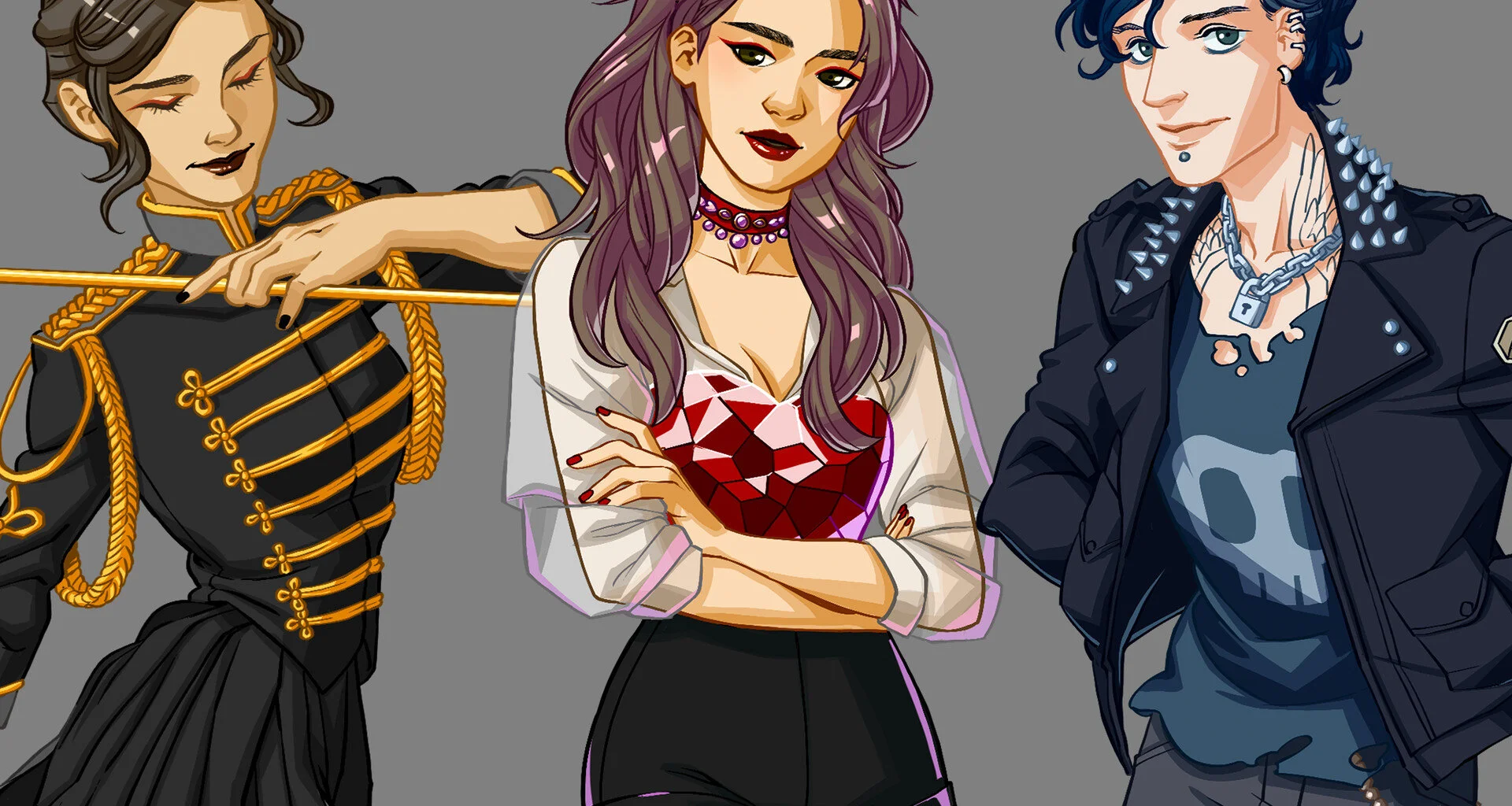
Fun with a splash of manga, this new look gave plenty of attention to the detail, hair, and makeup.
Item Redesign
Next up: the items. The old style of items was quite outdated. A cross between cartoonish in content but with realistic rendering.
They got similar treatment to the avatars: simplified cel shading and stronger linework.